Branding for L'Angelica Holiday Home, a bed & breakfast on Lake Garda, Italy
THE CHALLENGE
L’Angelica is a holiday house on Lake Garda opened by the young couple Angelica and Matteo in Spring 2019. The guests are warmly welcomed in a peaceful environment deeply inspired by nature. Their goal was to portray the natural and cozy environment of their Bed&Breakfast with a visual identity that could be rolled out from the logo to the smallest elements of their structure - offering their guests a seamless experience.


How might we create a visual identity inspired by nature that makes our guests feel at home while being away from home?


THE OUTCOME
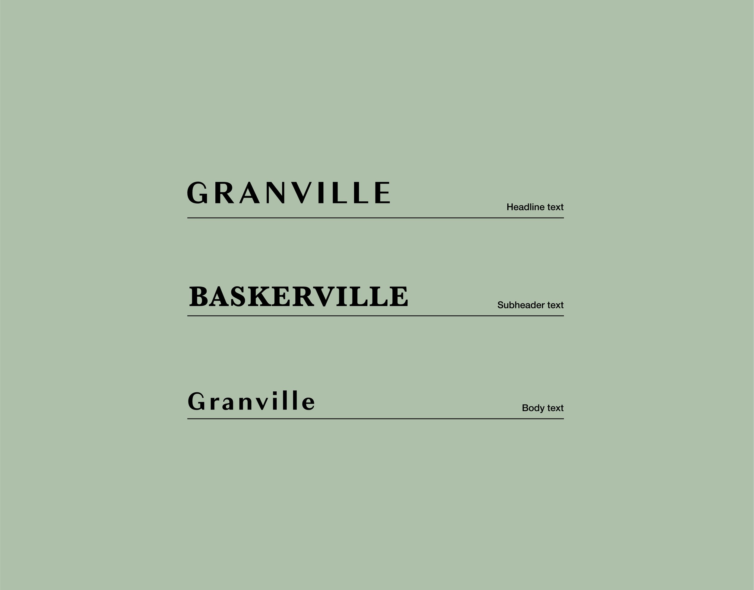
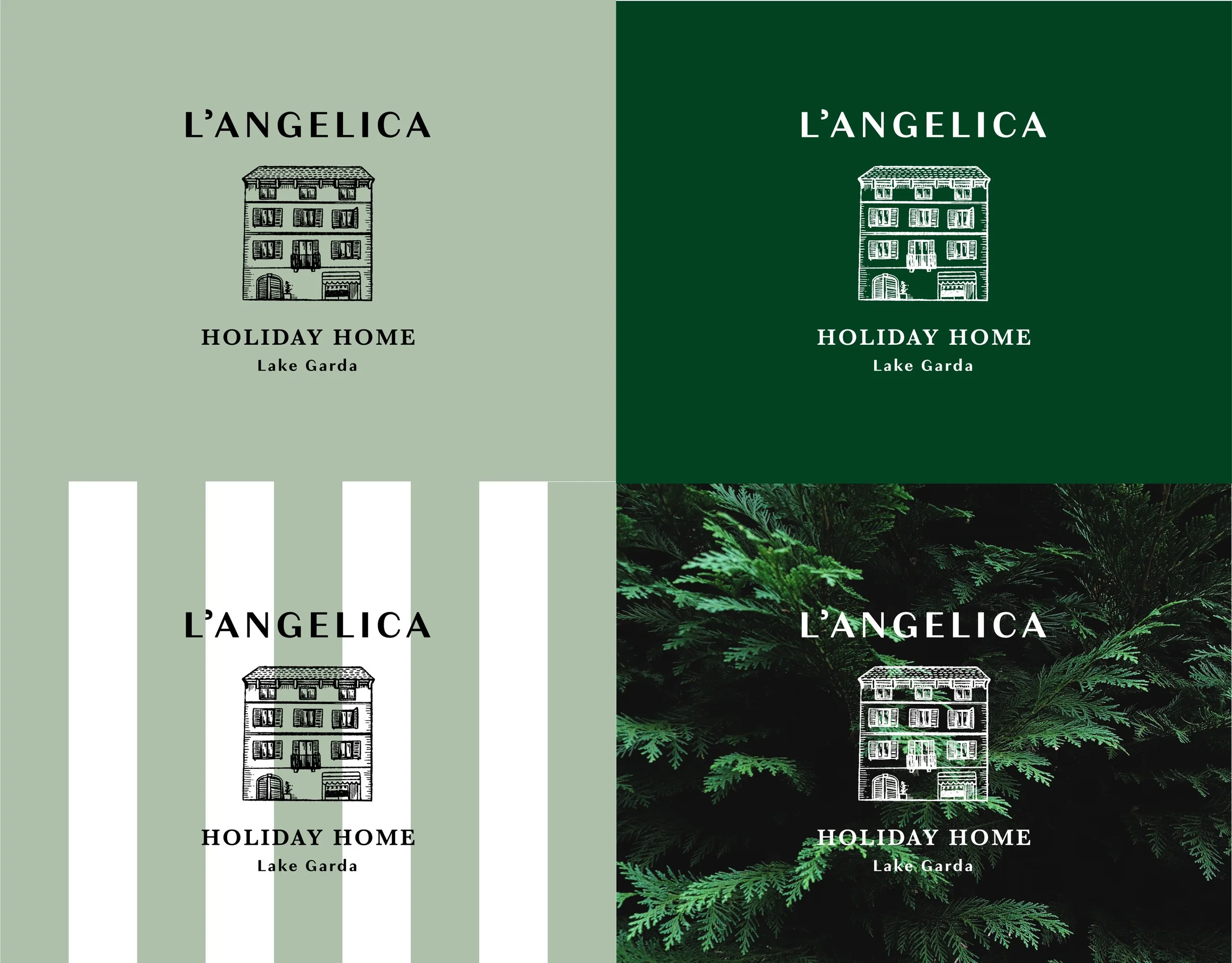
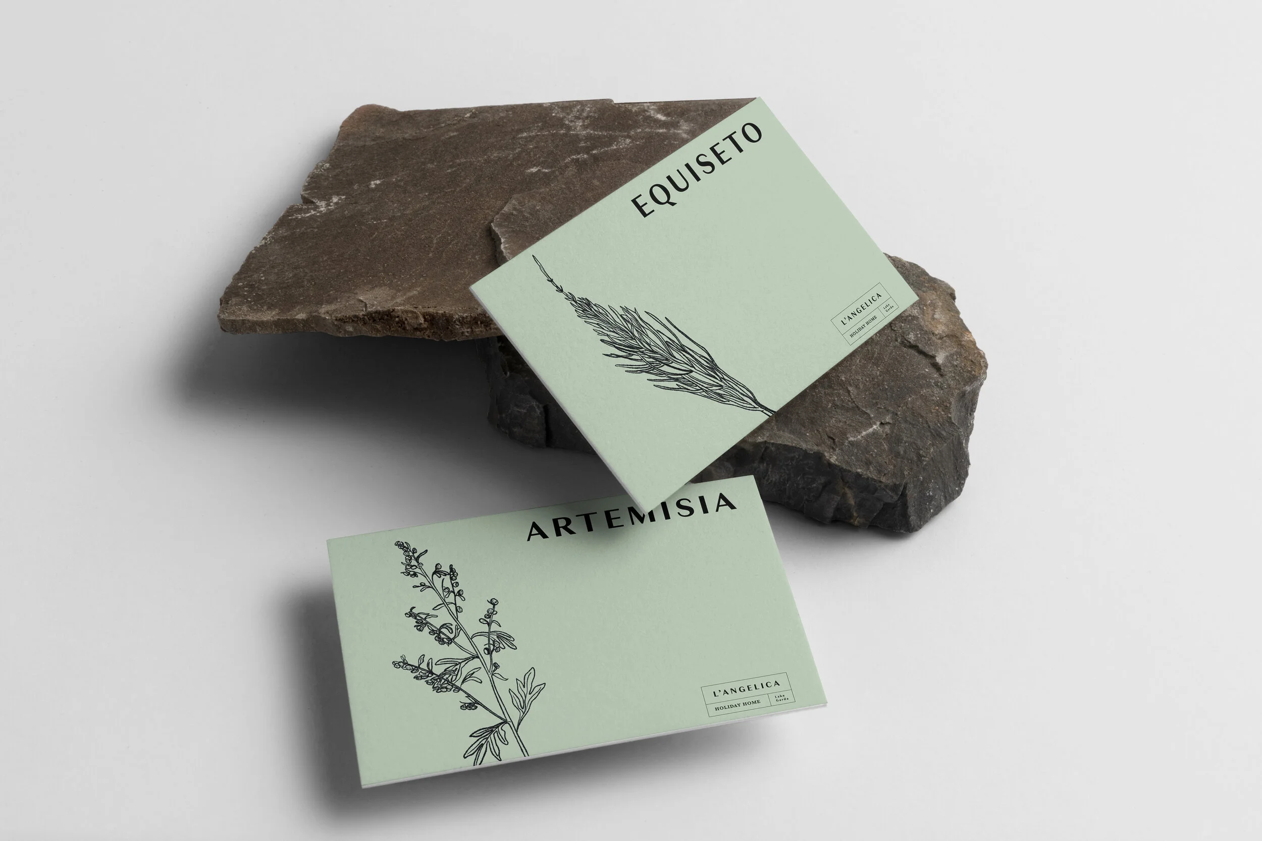
The overall style is illustrative and recalls old engraved pictures. The feeling is nostalgic, yet fresh due to the use of a sans-serif typography. The visual language is enriched with details which presence anticipates the care of the little things in the holiday home itself. The logo can be easily combined with different colors, patterns and background images without losing its visual power. Each apartment, named after a plant, gets a hand-drawn illustration, also physically present in the space.


