Art Direction, Branding and Illustration for Good Bank, a Berlin Food Company

THE CHALLENGE
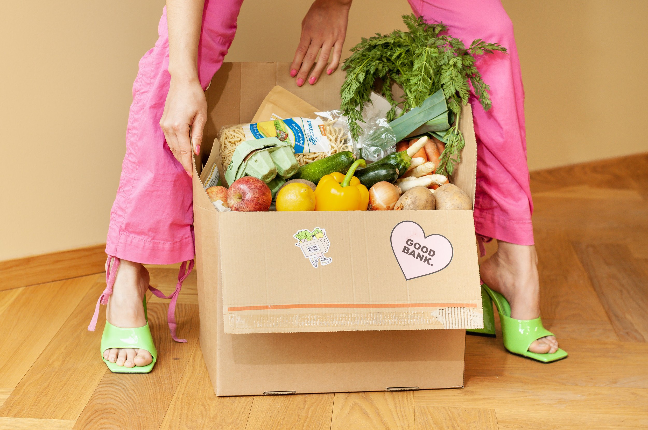
Good Bank, Berlin based Food and Hospitality company reached out to me with their existing brand style guide and the goal to brush up their visual identity in order to make it fresh, sustainable and bold. While doing so, we had to consider the fast growing nature of Good Bank that is quickly expanding from two restaurants in Berlin to consumer products in Supermarkets like Edeka, home delivery meals through Gorillas and ingredients delivery subscription boxes with their idea of Good Farm Box. Therefore, the identity had to be easily scalable, yet consistent and fun.

How might we iterate the existing Good Bank branding while adding freshness, sustainability and boldness to a fast-growing company which design needs to be original yet easily scalable?


THE OUTCOME
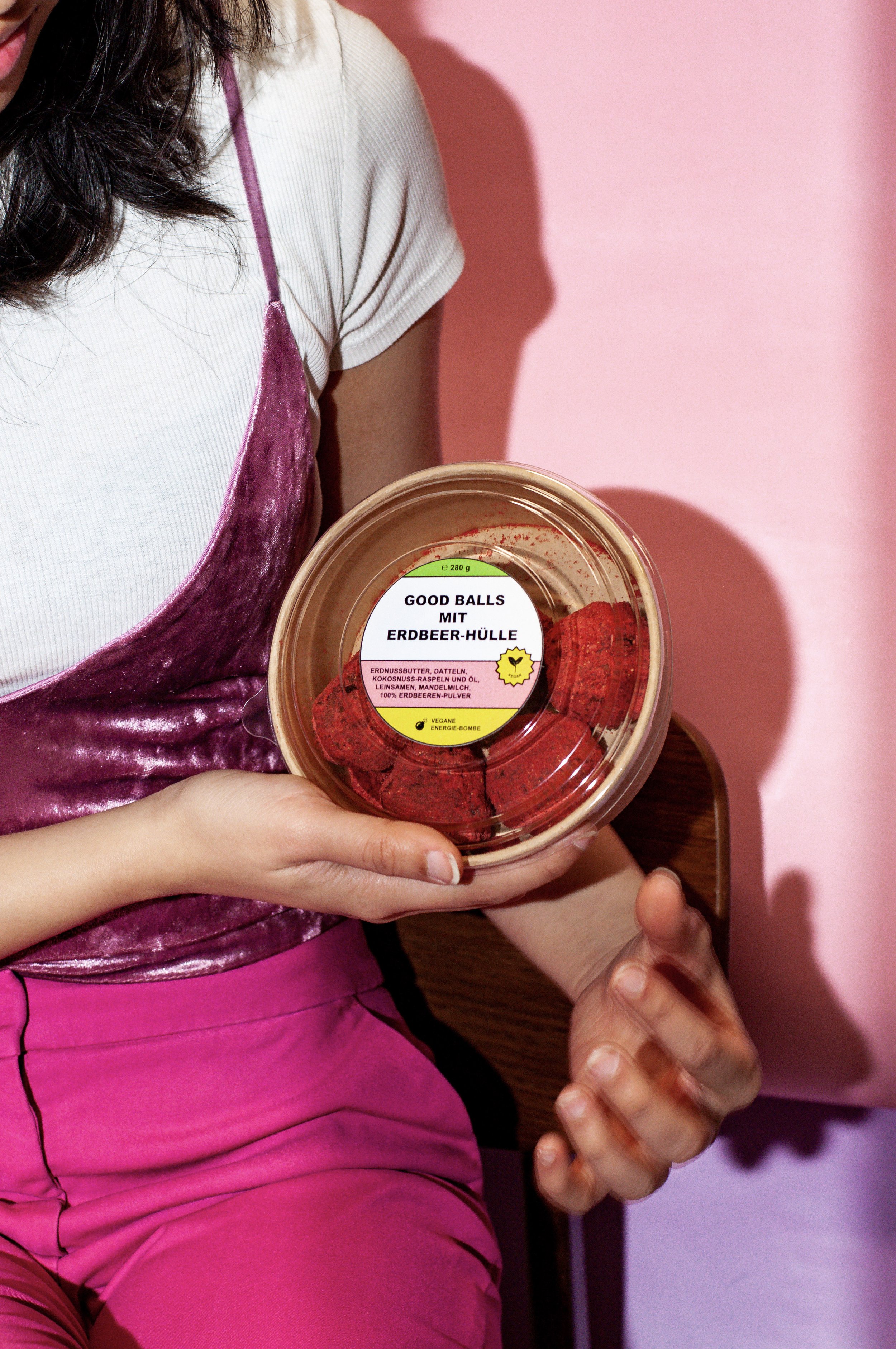
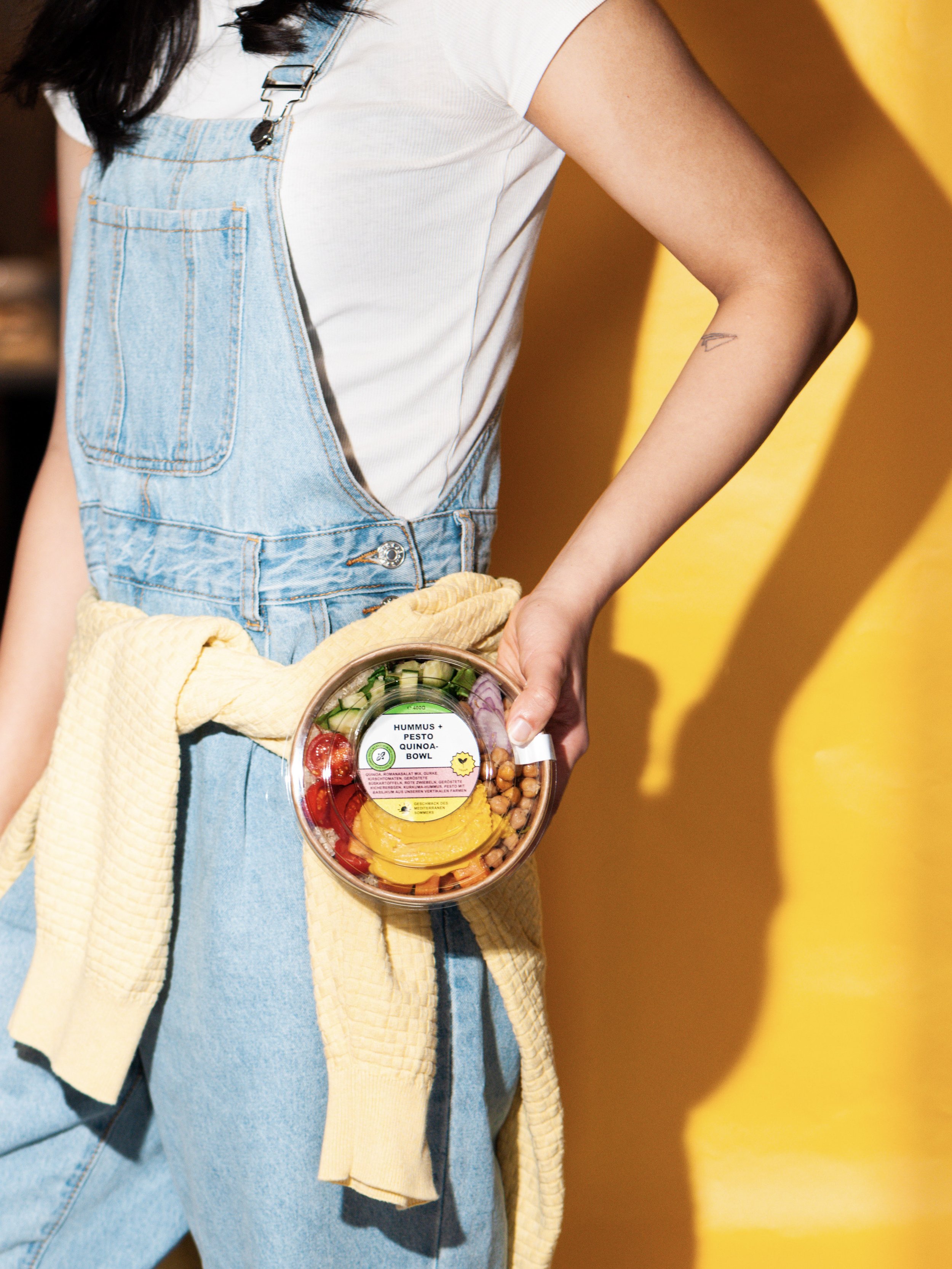
We worked on the brand identity first refreshing the colors and adapting the to the print needs. Furthermore, we started adding icons and illustrations to the visual identity so that we could balance the need of typography and explanatory copy. Once set with that, we started scaling it to all the needed labels which, in the case of food also had to take into account a given hierarchy of types and ingredients. Our goal was to establish a set of colors combinations that could guide the customer through the buying process while mixing good design and clarity of information. Together with the food labels we also worked on a set of stickers, illustrated decals, flyers, manuals, postcards and menus that keeps on expanding to today as Good Bank grows.


